Shortfundly, a Chennai based startup strives to create a platform i.e a go-to social media space for people who are willing to do anything related to short films.
As of 2019, there exists no platform like Shortfundly where short film industry people, film festival organizers, and artists who seek crowdfunding for their projects share a common platform. Making such a platform and reaching out to the millions of people in these industries is one their key goals.
There exists a huge gap between these communities. Making a bridge to connect them is all what Shortfundly is about.
Making an Android App for the platform can achieve the goal since the world has gone mobile.
Role UX/UI Design Intern
Digital Tools Adobe XD, Adobe Photoshop
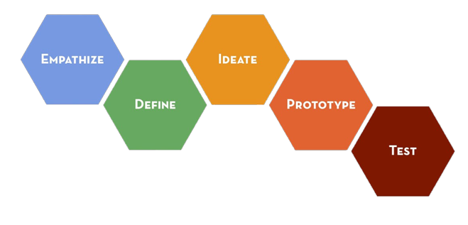
Stanford D School Design Thinking
At the time of this project, IDF was mainly discussing more about the Stanford D School Design Thinking process. Applying and getting a hands on experience with one of the best process's in the world seemed like a good learining experience. Hence the project was done using the same process. Every module went through each of the process stages.
Stakeholder Interview
Initially, a stong understanding of the features the product will provide was needed to be made. We needed to share a common view regarding the future of the app and all the problems it will solve. After many telephonic converstaions, Hangout calls and numerous visits to the companys' website a proper understanding was made and all my doubts were clarified.
Initial Research
We first analyzed several other apps on the PlayStore to discover how they went about creating a application that met the needs of users who were striving to solve the same problem. This was done in order to have a better understanding of what is already available, how are they doing it, how can we improvise the same in our app. Many details were taken note of and helped us very much during the ideation phase.
User Interviews
Now that we knew, what we could provide, it was time to understand what our users actually needed. We needed to ensure that we made note of their requirements and tried to map the possible ones with the company's goals. All the details they required were learned here. We also made note of different users possible, using which we created personas in the next phase.
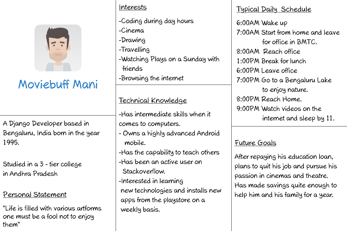
Personas
During our research phase we discovered that our main users broadly could be categorised into four categories. Personas were made for each of these categories.
- Movie Enthusiasts
- Artists
- Film Festival Organizers
- Crowdfunding Seekers
Throughout the entire design process, the personas were used to create, find and solve problems a particular user might find while using the app.
Exploring & Sketching
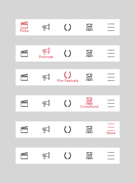
After finding out the different types of users we had an important decision to make. We had to give importance to all of them equally yet Movie Buff Mani was supposed to be our main customer,because largely the user base contained this category.
This issue was solved by using bottom navigation which contains
- Flicks (Main)
- Promoting films
- Film Festivals
- Crowdfunding
- A hamburger menu
The reason to include a hamburger menu within the bottom navigation was to give importance to all our users and at the same time include other features provided by the company which can be easily accessible when added in future.
Now that the main navigation of the app was done, the next task at hand was to sketch as many designs as possible and choose the best one. After that was done we had to create userflow diagrams, to make sure all the possible paths are created during the prototyping phase.
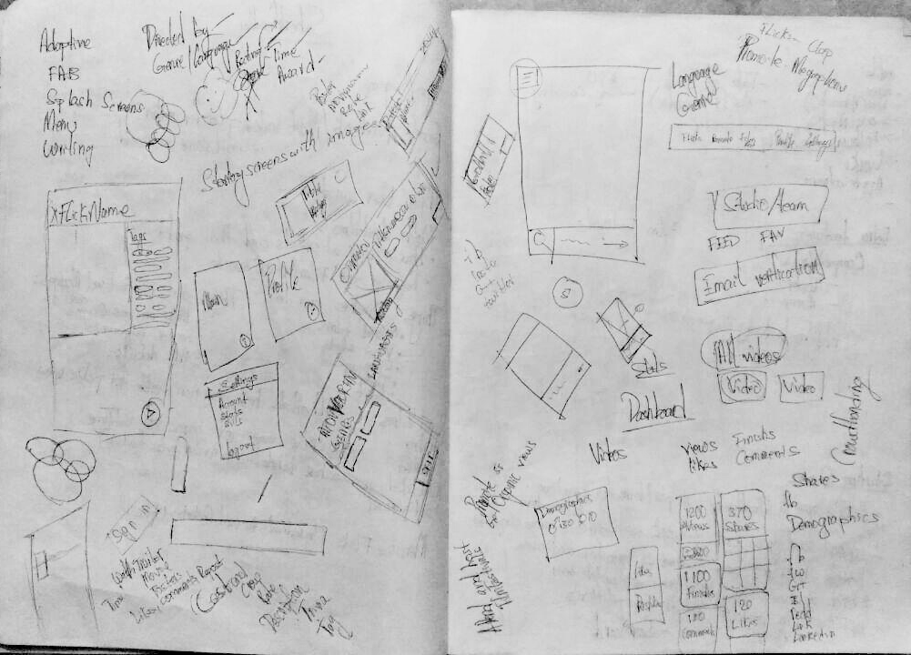
Sketching
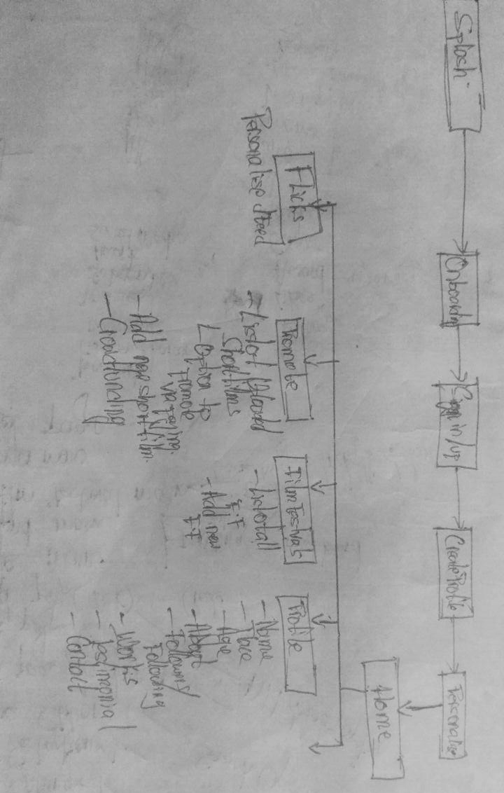
Userflow diagrams
Problems faced
During this phase, we discovered a problem. The platform had a lot of form filling. Many users don't like the long and tedious process, yet it being a crucial part, making the process easier and smoother was an important task for us.
After performing research, we came to the conclusion that 'Milestone Submissions' was our saviour. All the form filling screens in the app follow this concept. 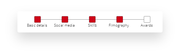 This method divides the questions into categories and shows the user how many screens are left before the entire process is done. This reduces cognitive load on the user and encourages them to fill the form.
A problem we avoided in this version of the app
The company initially planned to allow users to start crowdfunding campaigns right from the app. After thorough research with users and the competitors, we came to a conclusion.
The process of starting a campaign involved a lot of research, confidence, and freedom of thought. One needs to have a wave of creative words and thoughts in order to make a campaign strong and acceptable. People continuously search the web for more thoughts and inspiration while doing this.
This is not possible on the small screen. It restricts one to do the necessary research. Though challenging, due to time constraints, we could not design the "Create campaign" screens for this version.
We decided to divide the project into several modules and work on them separately. This was quite helpful from a UI perspective because regular feedback from stakeholders and users helped us make the necessary changes quickly and use the obtained knowledge for the upcoming modules.
Since we were working in such fast-paced small modules we resorted to not making any wireframes in the initial stages. This was because any changes that were needed to be made, was done immediately on the prototype and the re-work was very minimum.
The problem with wireframes is you can’t change something and limits the visual design thought process. Sketching wouldn't suffice our creative thirst!
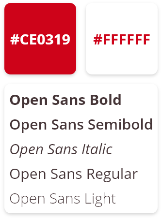
The only constraint was to use Open Sans as the main font throughout the app. The app had to appeal to professionals as well as casual users. White was chosen as the background color as it looks professional and does complement the SF red in a nice way.
A lot of the decisions came directly from Google's Material Design guidelines. Extensive research on best design practice was done for creating a pleasing UI for the cards and menus.
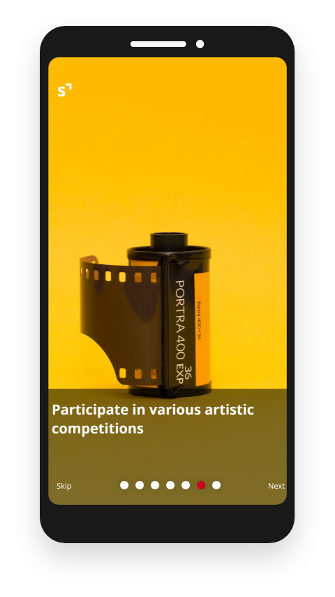
Onboarding
The app has a lot of wonderful features to offer to its users. Not knowing what they could do might leave them perplexed, which is not good UX.
Onboarding screens were the solution to this. These screens make the user aware of all the features available and makes them feel comfortable.
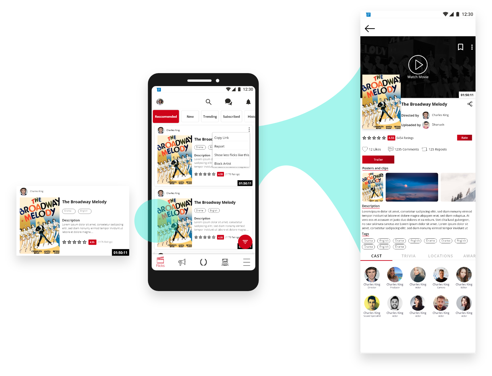
Flicks Screens
It being our homepage, the flicks screens was our main focus. We had to provide both the overview and detail screens for each flick. All necessary details were added in the respective views, thereby giving information only if needed.
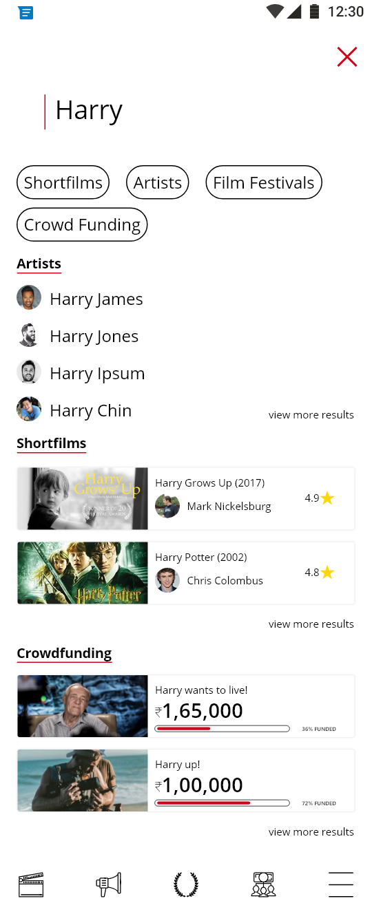
Searching
Searching was designed such that all different forms of artwork could be found with one search. The user can search specifically by tapping on any module and gain more detailed search results.
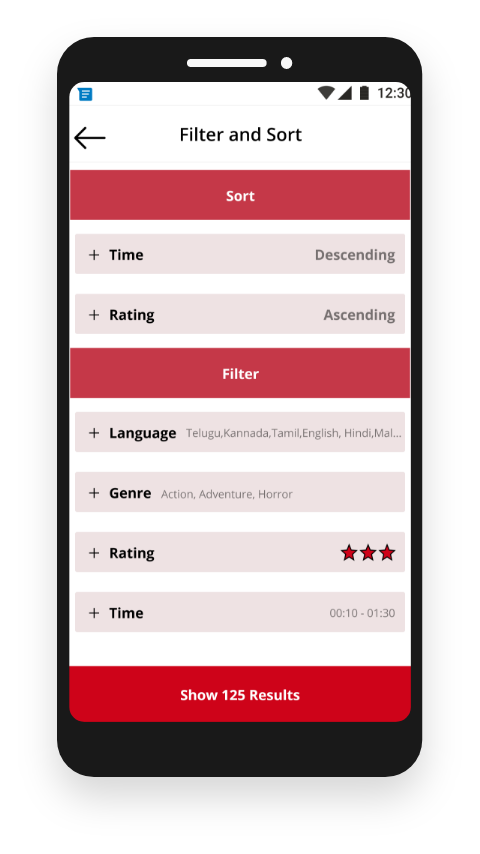
Filtering and Sorting
Given the amount of data the platform already holds and the amount it will gain in future, filtering and sorting would play a crucial role in browsing through content in the app.
It was designed such that the result is obtained using very taps from the user.
Numerous Iterations
None of the work which was done in the first sprint remained. With constant feedback and better ideas, we were able to achieve a great response from our users.
We had to revisit each step for every module to make Shortfundly, the app, appeal to both its users and stakeholders.
After each module was completed it was tested with friends and users. With their valuable feedback regarding their pain-points and extra requirements we could add to improve the UX, the final product was designed.
The product is currently under development.
A lot!
Managing the project along with my academics was challenging. I would improve the User Interface, and make a design system for the platform. That'd have been highly useful for the next designer to work on the app. I'd definitely work on and design the Create Campaign screens and make sure the process is seamless and comfortable for users.
Again, a lot!
Learned quite a lot regarding practical UX design principles along with Material guidelines. Working with other designers and collaborating with stakeholders was a great learning experience. Working on the latest software tools and sites has helped me broaden my knowledge.
If you're a newbie searching for real-world projects, Angel.co is one of the best platforms where Startups hire people. It was here where I got this opportunity to work as an intern. Working with startups is really beneficial as your learning curve is exponential (given that it's a good company). Do give it a try.
Hope you have a great learning-and-working experience!
.png)